
Taking the Pulse of a Working Group: A behavior-based, triangulated diagnostic for group learning
The Problem
In 2016, the board asked a simple, uncomfortable question:
Are our working groups actually functioning as collaborative engines for change, or are we just meeting a lot?
At the time, I supported nine cross-sector working groups spanning education, health, and economic mobility. Each one had a volunteer chair, a staff liaison, a theory of change, and a full calendar of meetings. Every group was busy. Every group had members who cared. Every group could show you an agenda.
What the board could see was that a small number of groups were performing as expected, groups working collectively toward a common goal and seeing progress toward goals. Many of the others weren't. They were meeting, had a volunteer chair, had engaged members, but they weren't making progress the way leadership expected. Some were still forming. Some were stuck in conflict. Some were organized, but not yet aligned. To use Tuckman's language, leadership was looking at a portfolio of groups scattered across forming, storming, norming, and performing, with no way to tell which was which, or why.
The board and leadership didn't need a report on activity. They needed something tangible: a way to see where each group actually was, what was holding it back, and where support would make the biggest difference. Specifically, they wanted to know:
- whether the right people were at the table
- whether decisions made led to coordinated action
- whether data was being used to guide strategy
- whether anyone could clearly articulate progress toward results
We didn't have a good answer. We had agendas, attendance lists, and a sense that some groups were working better than others, but we couldn't concretely explain why.
The Stakes
Most coalitions don't fail loudly; they fail for quiet reasons such as meetings that go nowhere, decisions that don't translate into action, members who stop showing up because they can't see what their time is building toward. A coalition is only as strong as the members who stay engaged and feel like they are a part of something bigger than any one meeting.
Members across groups were starting to ask what the point was. As expected, a few members stopped coming, others sent interns in their stead. Not every organization is set for collaboration, and that’s okay. However, I start paying closer attention when the most engaged members, our biggest cheerleaders, start wondering if it's worth their time. Once your champions disengage, they rarely come back, and the institutional relationships they carry go with them.
Leadership felt the cost too. Without a way to see where each group actually was, they couldn't allocate support. A group that needed facilitation looked the same as a group that needed restructuring. A group that had lost its purpose looked the same as a group still finding it. Backbone staff were spread across the nine groups with no way to triage what was happening.
It might be easy to blow it off as growing pains, but it’s important to remember why the working groups were meeting in the first place: the communities the coalition served. Issues around education, health, and economic mobility don't wait for a working group to figure out how to collaborate. Every month a group spent drifting was a month the problem wasn’t getting solved. Keeping this in mind, we realized the stakes weren’t that the coalition would collapse; but rather that it would continue with major faults. The groups would keep meeting, appear functional from the outside, but in reality the people and the purpose were quietly forgotten.
The Framework
I drew on four bodies of research to build the tool. Each answered a different part of what the diagnostic needed to do, and each one shaped specific domains in the framework.
FSG
In 2011, John Kania and Mark Kramer published Collective Impact in the Stanford Social Innovation Review, naming and defining collective impact as a model, and they have been its guiding voice ever since. Their work provided a clear, practical model of what a functioning working group actually does, grounded in experience with collective impact initiatives across the country. It named the roles, the rhythms, and the responsibilities that a healthy working group needs to have in place. Starting anywhere else would have felt like reinventing the wheel. Their model is visible across the whole framework, but especially in the Composition domain, where their guidance on membership, chairs, and backbone support translated directly into indicators.
Team Collaboration Assessment Rubric (TCAR)
Building upon decades of research into collaborative practice, the Team Collaboration Assessment Rubric (TCAR) has been refined and field-tested by university researchers, evaluators, and practitioners. Most coalition assessments ask how members feel about their group. TCAR asks whether specific behaviors were present: whether decisions were made with the right people in the room, whether roles were clear, whether conflict was handled constructively, whether the group adjusted when strategies weren't working. That distinction, from feelings to behaviors, became the spine of the diagnostic and shaped indicators across each domain, but most prominently in Communication and Accountability & Evaluation.
Cross-functional Collaboration
Working groups are cross-functional by definition, bringing together people from different institutions, sectors, and roles. Decades of research on cross-functional teams and team science has mapped what makes these groups work or fall apart. Cross-functional research reframed "the right people" from a roster question to a systems question. It wasn't about who was on the invite list; it was about whether the people in the room had the expertise, authority, and relationships to do the work together. This research shaped the Composition domain, and also runs through Communication, where balanced participation and constructive conflict are both features of functioning cross-functional teams.
Results-Based Accountability (RBA)
A group can be collaborating beautifully and still not moving the thing it was convened to move. Mark Friedman's Results-Based Accountability, and specifically its Turn the Curve thinking, gave me the structure for connecting group-level effort to community-level results. This thinking made sure the diagnostic wasn't just about functionality, but about driving results. You will find RBA's influence most in the Defined Result and Data-Driven Decision-Making domains.
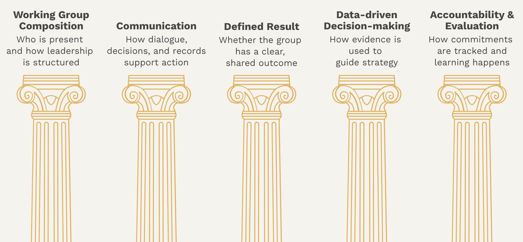
Four of the five domains answer the board's questions directly. The fifth, Defined Result, doesn't. It was a decision I made in the design. When every group has a theory of change and a staff liaison, it is easy to assume everyone agrees on the shared outcome. A theory of change on paper, however, isn't the same as a shared understanding in the room, and it doesn't account for new voices who may have entered later. Making that assumption explicit felt important.
The Data Model
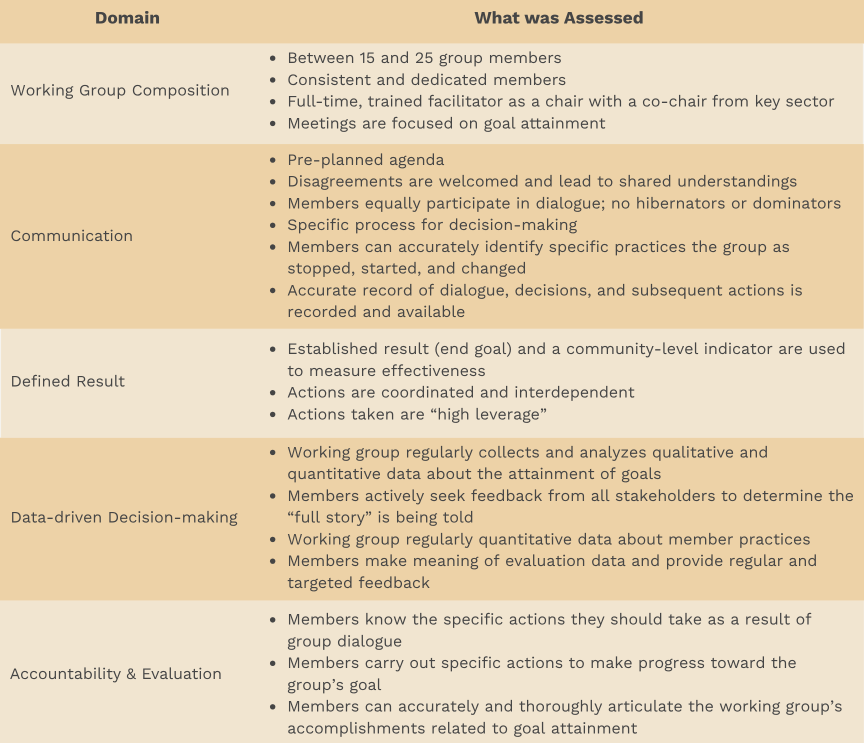
The Working Group Pulse Check tool translated the framework into a structured, measurable system that produced actionable scorecards. Each of the five domains was operationalized through concrete, observable indicators rather than subjective impressions. A conceptual domain doesn't measure itself. Two backbone staff watching the same meeting could come away with completely different impressions of how a group was communicating, and neither would be wrong. The indicators had to be observable, not interpretive.
The response format was binary. Yes or no. Present or not present. No scales, no "sometimes." That was a deliberate choice. Most coalition assessments use Likert scales, strongly agree to strongly disagree, and they produce soft, diplomatic answers that average out to "somewhere in the middle" for almost every group. Binary forces commitment. "Was there a pre-planned agenda?" is a harder question to wiggle out of than "how strongly would you agree that this group tends to have pre-planned agendas?"
At the end of each domain, respondents could leave open comments, answering the question, "Is there anything else you'd like to tell us about the domain?" The yes/no answers gave the tool its structure; the comments gave it its texture.
Two things became possible once the domains were operationalized at this level of specificity.
- Consistent Measurement: The tool produced the same measurement across nine different working groups without requiring the person administering it to be an expert.
- Interpretable Disagreement: When a chair said yes and members said no, that wasn't a soft difference on the rating scale. It was a concrete disagreement about whether a specific thing was happening.
The Methodology
Collective impact initiatives tackle complex issues, and often there isn't one single action that fixes everything. More often than not, it's a combination of actions and perspectives that drives successful outcomes. I carried that mentality into this tool. Everyone has a valid viewpoint and a legitimate opinion; it just isn't the whole picture. Triangulating feedback across three distinct perspectives, working group chairs, working group members, and staff liaisons, ensured the diagnostic captured not just how a group saw itself, but how it was experienced by the people facilitating and participating in the work.
The same instrument was given to three distinct roles within each working group: the chair or co-chairs, who facilitated the group through its process; the members, who were active participants in the work; and the staff liaison, who filled in gaps as they could, anything from technology fixes to noting best practices from the field. Triangulation ensured the tool captured the full experience of the group rather than a single perspective.
Once the three perspectives were shown side by side, it was clear I was no longer just measuring whether the action or expectation happened. I was measuring whether everyone had the same shared understanding of the working group's health: shared agreement, shared disagreement, or, most interesting to me, where perceptions diverged. Divergence signaled misalignment, a potential governance risk, or performance gaps that needed addressing.
Below are a few patterns that emerged while analyzing the data:
- Healthy Disagreement: Three perspectives yield different answers because each role is applying its own standard. The disagreement opens a line of communication and provides the opportunity to create shared understandings.
- The Positive Outlier: One perspective, usually the chair, sees indicators of health others don't. They are remembering what's working. The other perspectives are focused on what isn't.
- Consensus: All three perspectives agree. When they agree an indicator is present, it is a moment to celebrate. When they all agree it's absent, the group has a shared problem to address.
A single score on a survey tells leadership a group is doing well or not. Triangulated data tells them something more useful: where the group is healthy, where it's struggling, and where the people inside it disagree about which is which. That last category was almost always where the most actionable work lived.
The Visualization
I hate creating visualizations that create more questions than answers, so I needed a format that was quick to interpret. I didn't want leadership and working groups to spend time debating what they saw. I wanted them to see it, understand it, and start taking steps for improvement where necessary. What resulted was two complementary outputs: an individual working group scorecard and a cross-coalition summary view, designed not just for visibility but for strategic learning and continuous support.
The individual scorecard gave each group a structured, non-judgmental snapshot of how it was functioning across the five domains. By combining yes/no indicators with qualitative comments, it helped groups see their own strengths, blind spots, and areas where additional facilitation or alignment would be most useful. It created a concrete starting point for reflection and course correction rather than relying on informal impressions or personality dynamics.
The cross-coalition summary scorecard allowed leadership to see how collaboration was functioning across the entire system. Instead of treating each working group in isolation, they could compare patterns, identify common challenges, and prioritize where backbone support, facilitation, or structural changes would have the greatest impact.

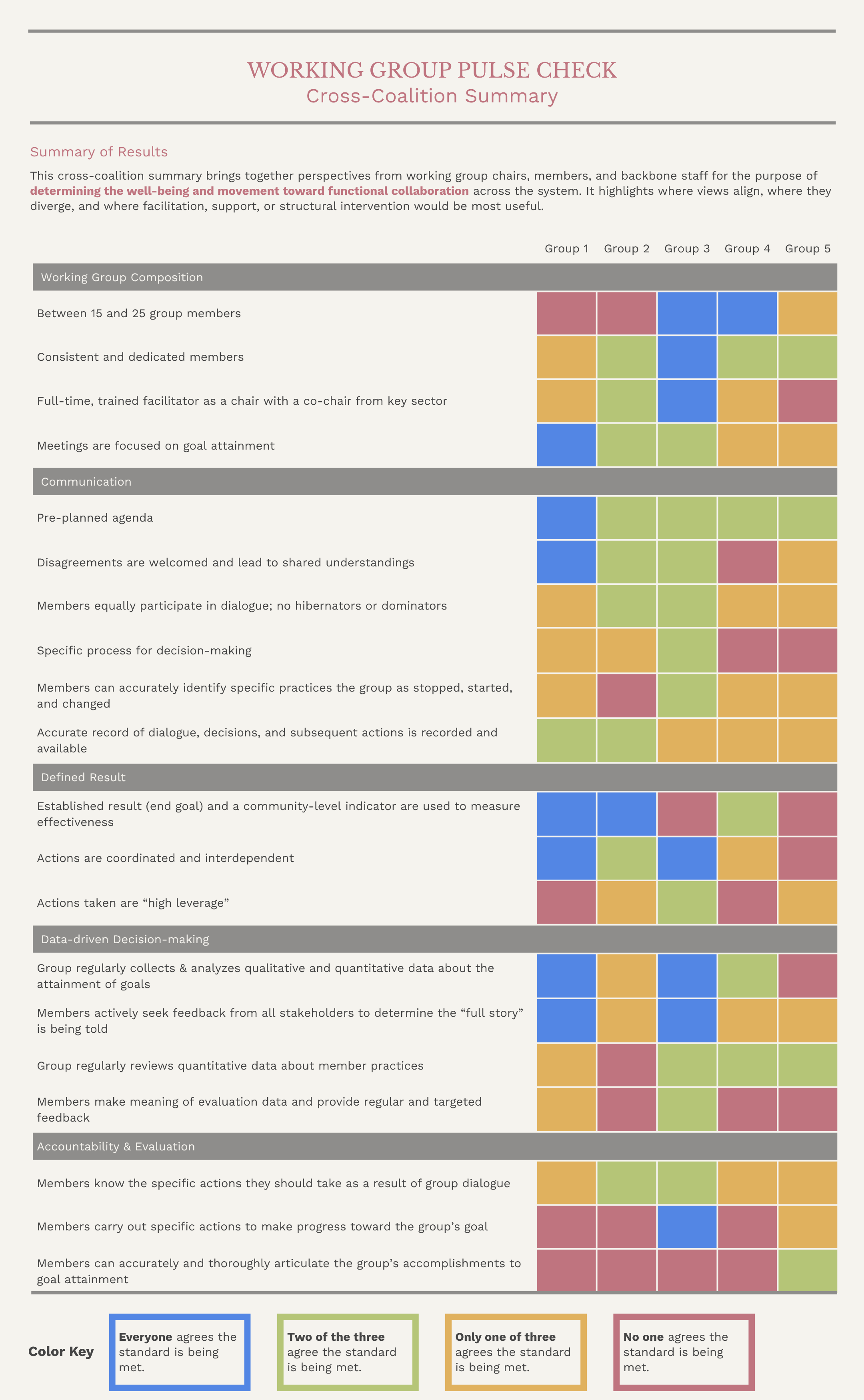
A working group can't improve by looking at the whole system, and leadership can't steward the system by looking at one group at a time. The two scorecards were built to be used together.
The Findings
Before the diagnostic, leadership had attendance lists, meeting notes, and a general sense that some of the working groups were doing well and others weren't. After the first round, they had something concrete. Each group had a scorecard. Each scorecard showed where the three perspectives aligned and where they didn't. That was enough to move from guessing to action.
At the system level, leadership could quickly see:
- which working groups had strong facilitation, clear results, and coordinated action,
- which lacked shared accountability or meaningful use of data, and
- where targeted support or structural redesign was needed.
One of the more interesting findings was in the Defined Result domain. Chairs tended to indicate the group had a shared outcome. Members didn't always agree, especially if they joined later in the process. It was less about anyone being wrong and more about how working groups change over time. A group can set a shared outcome at launch and genuinely have alignment in the room that day. Working groups change. As members rotate in and out, that alignment has to be rebuilt or it quietly erodes. The diagnostic surfaced groups where the original alignment was no longer shared, and wherever that pattern showed up, it was usually worth pausing the work and re-grounding the group before anything else.
The tool also created a shared language across working groups for what effective collaboration looked like. The vocabulary mattered beyond any single scorecard, because when chairs, members, staff, and leadership all used the same terms to describe how a group was functioning, it became easier to set expectations, offer feedback, and support continuous improvement without those conversations turning into personality debates.
What Makes This Possible
A diagnostic is only as useful as the conditions that let it operate. This tool worked because several things were already in place before I started building it.
- Nine working groups with meeting history. Nine groups meant the patterns weren't coming from any single group's situation. Each had been meeting long enough to have a culture, a theory of change, and relationships that could be observed. A newer coalition with two or three working groups would have needed a different tool.
- Assigned roles in every group. Chairs had names. Staff liaisons had names. Members could be identified, not just counted. The tool depended on three distinct perspectives being collectable, and that required three distinct roles to collect from.
- Backbone staff with the capacity to run it. Collecting, processing, and returning data for nine groups on a consistent cadence required time, tools, and people. The coalition had invested in backbone infrastructure long before this tool existed. Without that investment, the diagnostic would have sat on a shelf.
- Leadership willing to be told hard things. The tool only works when leaders actually want the answer, even when the answer isn't flattering. The board had asked the uncomfortable question in 2016, and they wanted to hear what we found.
- Member trust that honest answers wouldn't be used against them. Triangulation doesn't work if anyone feels unsafe to share. The tool depended on chairs, members, and staff being willing to disagree with each other in writing, and that trust was built over years, by backbone staff and leadership making good decisions with the data they collected.
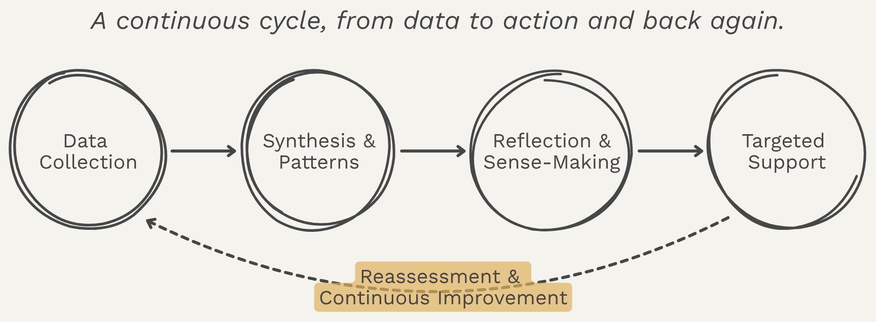
The diagnostic only creates change if the data moves. The feedback loop connects working groups, backbone staff, and leadership in a shared learning and support system. It links group experience, facilitation, and leadership decision-making so that feedback translates into targeted support and continuous improvement over time. The scorecard is the start of a conversation, not the end of one. What makes the tool sustainable isn't the instrument itself. It's the cycle it sits inside.
Why It Matters
Together, the two views turned collaboration into something that could be discussed, supported, and stewarded over time.
Coalitions sit at the center of some of the most complex work in communities. They bring together people from different institutions, sectors, and lived experiences to solve problems no single organization can solve alone. Without shared structures for accountability, decision-making, and learning, even well-intentioned collaborations can drift, stall, or unintentionally reinforce the very inequities they are meant to address.
The Working Group Pulse Check made collaboration visible and governable. It gave leaders and facilitators a way to understand not just what groups were doing, but how they worked together, where responsibility was concentrated, and where support was needed. Grounded in data, dialogue, and shared expectations, the tool helped shift working groups from activity toward collective action.
This same approach carries into my broader work in data infrastructure and systems design. Whether the system is a coalition, a partner network, or a data platform, the goal is the same: to build structures that turn shared purpose into coordinated action, while keeping the people doing the work, and the communities they serve, at the center.
Want to Dive Deeper?
If any of this resonated and you want to keep going,
here's where I'd send you next.
How to Lead Collective Impact Working Groups by Daniela Uribe, Carina Wendel, and Valerie Bockstette at FSG.
This toolkit was my starting place. It gave me a clear, practical model of what a functioning working group looks like, including roles, rhythms, and responsibilities, grounded in FSG's experience across collective impact initiatives nationwide. If you've ever wondered what "good" actually means for a working group, this is where I'd point you.
Trying Hard Is Not Good Enough by Mark Friedman.
This is where Mark Friedman lays out Results-Based Accountability and Turn the Curve thinking. The title alone is a useful reframe. A working group can be doing all the right things and still not be moving the thing it was convened to move. I keep coming back to this one whenever I'm tempted to mistake activity for progress.
The Wilder Collaboration Factors Inventory: Assessing Your Collaboration's Strengths and Weaknesses by Paul Mattessich and colleagues.
The Wilder Inventory was one of the first tools to translate "what makes collaborations work" into something you could actually measure. It identifies twenty factors that show up in successful collaborations, from shared vision to communication patterns. I came to it after the FSG toolkit, and it gave me a vocabulary for naming the conditions a working group needs in place to function as one.
"Evaluating Organizational Collaborations" by Rebecca Woodland and Michael Hutton, published in the American Journal of Evaluation.
I first came across the Team Collaboration Assessment Rubric (TCAR) at an AEA pre-conference workshop in 2017, where we walked through the tool and its use cases. What I appreciated most from the experience was the movement away from measuring how people felt about a collaboration to measuring concrete behaviors. That shift, from feelings to behaviors, became the spine of the diagnostic.