
Moving Beyond Participation: Measuring affiliate health through engagement pathways and network structure
The Problem
Most organizations that run affiliate or chapter networks can tell you how many people showed up. Fewer can tell you whether those people are connected to each other, whether their engagement is deepening over time, or whether the affiliate would survive the departure of its most active member. Attendance data answers one question: did they come? It does not answer the questions that matter most for organizational health.
This project builds a framework that does. Working with a synthetic dataset modeled on common patterns in distributed organizations, I designed a dual framework that pairs a ladder of engagement with social network analysis to produce a relational picture of affiliate health. The result is a methodology that makes visible what attendance data cannot: who is connected to whom, whether engagement is sustained or fragile, and where the structural risks live before they become crises.
The framework moves through six steps: define the framework, build the data model, transform source data using dbt, analyze network structure using NetworkX, visualize the network in Kumu, and score and report affiliate health. Each step builds on the last. The output is not a single score. It is a health profile for each affiliate that holds three dimensions together: connectivity, sustained engagement, and dependency risk.
Note on data: This project uses a synthetic dataset modeled on common patterns in distributed organizations. The goal is to demonstrate the framework and analytical approach, rather than evaluate a specific organization.
The Stakes
A federated organization is only as strong as its affiliates. But affiliate health is rarely measured with the precision it deserves. A chapter with 20 members looks the same in a headcount report as a chapter with 20 members where one person runs every meeting, refers every new member, and holds every relationship together. Remove that person, and the affiliate does not slow down. It stops.
The gap between those two affiliates is not visible in participation data. It is visible in the structure of their networks. Density tells you whether connections are broadly distributed or concentrated. Betweenness centrality tells you whether the network depends on a single bridge. Engagement distribution tells you whether members are deepening their investment over time or stagnating at the surface. Together, those three measures make the difference between a resilient affiliate and a fragile one legible before the fragility becomes a crisis.
This framework exists because the cost of not knowing is not abstract. It shows up when a key leader steps back and the affiliate loses half its active members. It shows up when a chapter looks fine in the annual report and then goes dormant six months later. It shows up in every organization that has ever been surprised by a collapse that, in retrospect, was visible in the data all along.
The Framework
The framework has two components. Neither is sufficient on its own. The ladder tells you where a member stands in their relationship to the organization: how consistently they show up, and whether they are bringing others in. The network tells you how members are connected to each other: who is linked to whom, how strong those links are, and whether the connections are distributed across the affiliate or concentrated in a small number of people. Together they produce a picture of affiliate health that neither could produce alone.
The Engagement Ladder
Members move through the affiliate like steps on a staircase, each level representing a deeper investment in the work and the people around them. A member's level is not self-reported. It is assigned based on two observable signals: how often they attend events relative to how many were available, and how many people they have referred into the affiliate. The ladder has five levels:
| Level | Definition | Example | Attendance Rate | Referral Count |
|---|---|---|---|---|
| Observer | Member, but not attending | Long time listener, first time... well, not yet | 0% | 0 |
| Explorer | Attends occasionally | Shows up when the topic is right | 1-75% | 0 |
| Regular | Engages consistently | You could set your watch by them | >75% | 0 |
| Bridge | Consistent and grows the network | The one who says "you two should meet" | >75% | 1-2 |
| Anchor | Consistent and brings in the most people | The reason half the room is there | >75% | 3+ |
Attendance rate is calculated by dividing the number of events a member attended by the total number of events their affiliate held during their membership period. This accounts for the fact that affiliates vary in how active they are: a member in Phoenix had fewer opportunities to attend than a member in Atlanta, so raw counts alone would be misleading.
Referral count is the number of members whose referred_by is the number of members whose referred_by field points to that member. It measures network growth directly: who is actually bringing people in. Founding members with no referred_by record of their own are not penalized. What matters is whether they are growing the network, not whether someone recruited them.
The Network Layer
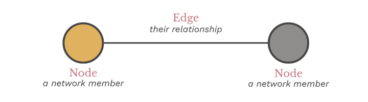
Social network analysis is a method for studying relationships. It treats people as nodes and the connections between them as edges. The structure those connections form reveals things about the group that individual-level data cannot: who sits at the center, who bridges otherwise disconnected clusters, and where the network is fragile.
The network layer sits alongside the ladder as a separate lens, not a replacement for it. A member can be deeply embedded in the organization: attending consistently, referring others in, while remaining isolated from their peers. The ladder would not surface that. The network does.
The network is built from two distinct interaction types. Co-attendance is undirected: two members who attend the same event share a connection, and the more events they share, the stronger the tie. Referral is directed: an arrow points from the person who made the introduction to the person who joined as a result. Together, the two interaction types capture both how relationships function in the present and how the network grew over time.
Why Two is Better Than One
The ladder and the network answer different questions. The ladder tells you about a member's relationship to the institution. The network tells you about a member's relationship to everyone else in it. An affiliate can have strong ladder distribution and a fragile network. It can have a dense network and an engagement distribution weighted toward the bottom. Looking at either one alone produces an incomplete picture. Looking at both together makes visible what neither could show on its own: whether the affiliate is healthy, where the risks live, and what is worth paying attention to.
The Data
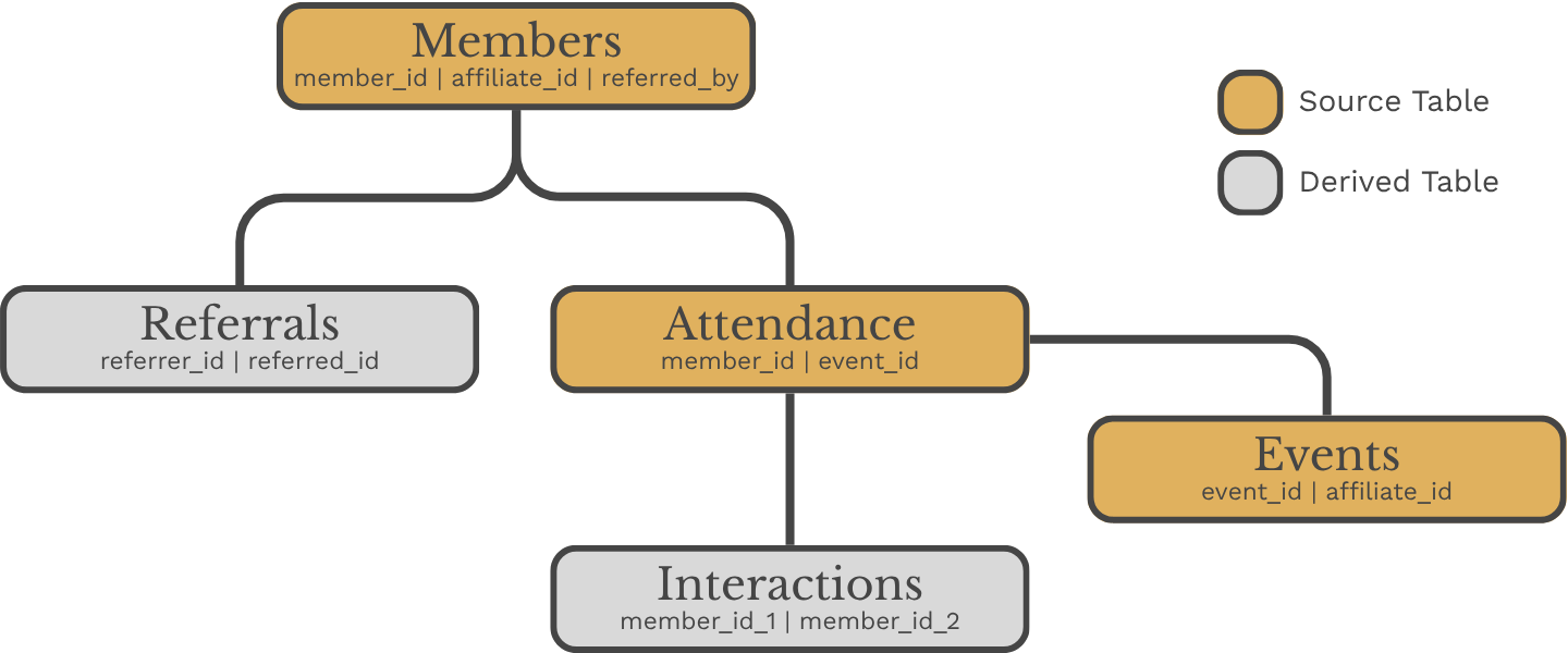
The dataset is built from five tables. Three are source tables that live in BigQuery: Members, Events, and Attendance. Two are derived tables produced by the dbt pipeline: Interactions and Referrals. The distinction matters. Interactions and referrals are not collected directly. They are derived from what members actually did rather than what they reported.
The Three Source Tables
The Members table holds individual profiles: who joined, when they joined, and who brought them in. The referred_by field is stored as a member name rather than an ID, making the data human-readable at the source. The dbt pipeline resolves it back to a member ID for analysis.
The Events table records each affiliate event, its type, and when it took place. The Attendance table records who showed up to what. One row per member per event attended. It is the simplest table in the model and the most analytically powerful, because everything downstream: interactions, ladder levels, network structure, is derived from it.
Data Dictionaries
member_idmember_nameaffiliate_idjoin_dateevent_idaffiliate_idevent_nameevent_typeevent_dateattendance_idmember_idevent_idmember_id_1member_id_2affiliate_idco_attendance_countinteraction_weightreferral_idreferrer_idreferred_idaffiliate_idjoin_dateThe Two Derived Tables
The Interactions table is derived from the Attendance table. Two members who attended the same event share a co-attendance record. The more events they share, the stronger the tie. Interaction weight runs from one to five, mapped from the number of shared events. A weight of one looks like two members who crossed paths once. A weight of five looks like two members who keep showing up together.
The Referrals table is derived from the Members table by extracting the referred_by relationship into a dedicated edge list. Each row represents a directed connection: the member who made the introduction and the member who joined as a result. This is the directed network. Arrows point from referrer to recruit.
How the Tables Relate
Together the five tables capture two distinct views of the affiliate. The co-attendance network shows how relationships function in the present. The referral network shows how the affiliate grew over time. Neither view alone is sufficient. Both together tell the full story.
The Pipeline
Three source tables entered the pipeline. Four analytical outputs came out. Everything in between is documented, reproducible, and version controlled.
The pipeline is built in dbt and runs against BigQuery. It moves through three layers: staging, intermediate, and marts. Each layer has a specific job. Staging cleans and casts the raw source data. Intermediate derives the analytical building blocks. Marts produce the final outputs used for analysis and reporting.
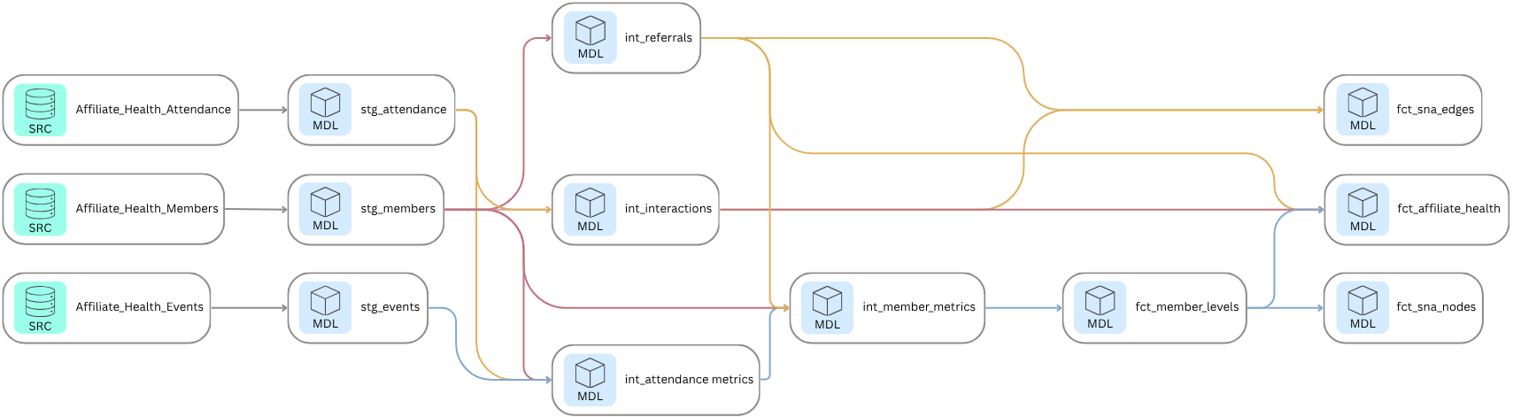
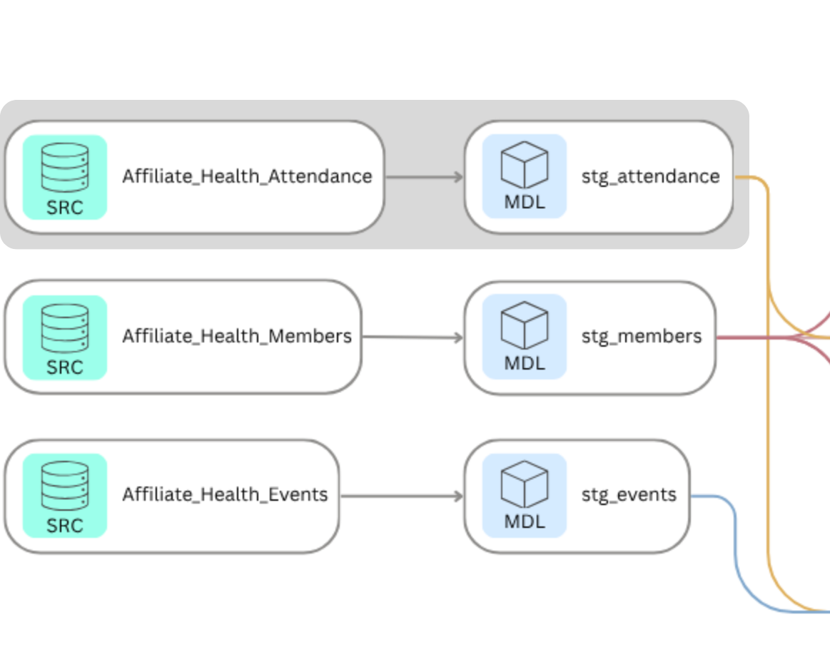
Staging
The staging layer pulls directly from the three source tables in BigQuery and prepares them for downstream use. Each model casts fields to the correct data types and handles one specific transformation: the Members staging model resolves the referred_by field from a member name back to a member ID via a self-join. This is the only place in the pipeline where that resolution happens, which means every downstream model can treat referred_by as a reliable foreign key.
with source as (
select * from {{ source('Affiliate_Health', 'Attendance') }}),
    staged as (select
        cast(attendance_id as int64)    as attendance_id,
        cast(member_id as int64)        as member_id,
        cast(event_id as int64)         as event_id
    from source)
select * from staged;
Intermediate
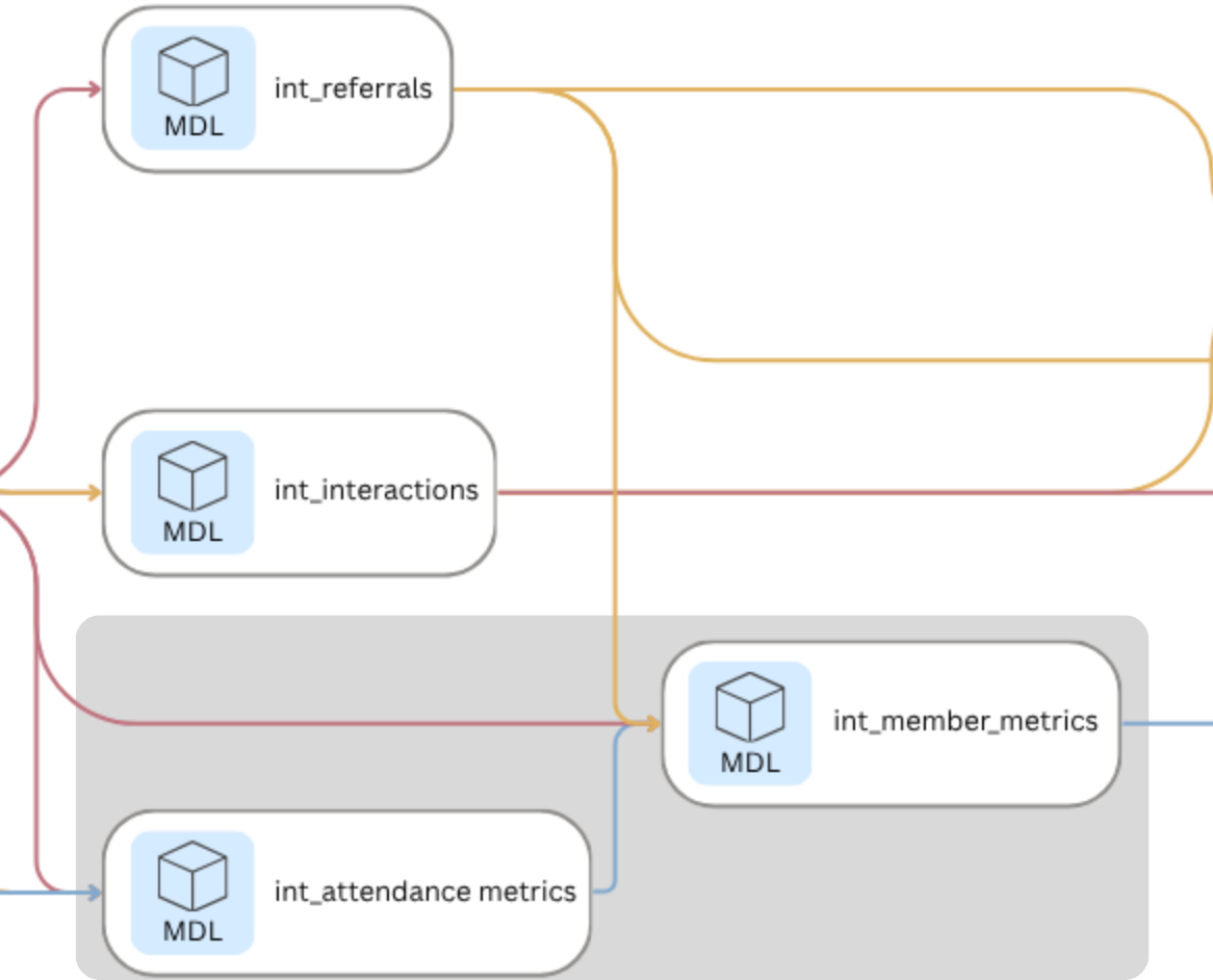
The intermediate layer is where the analytical work happens. Four models build progressively on each other:
- int_referrals extracts the referred_by relationship from the Members table into a clean directed edge list.
- int_attendance_metrics calculates attendance count and attendance rate per member, accounting for variation in how many events each affiliate hosted.
- int_interactions derives the undirected co-attendance network from the Attendance table, assigning an interaction weight of one to five based on how many events each pair of members shared.
- int_member_metrics combines attendance rate and referral count into a single member-level metrics table, which feeds directly into ladder level assignment in the mart layer.
with attendance as (select * from {{ ref('stg_attendance') }}),
members as (
    select * from {{ ref('stg_members') }}),
pairs as (
    select
        least(a1.member_id, a2.member_id) as member_id_1,
        greatest(a1.member_id, a2.member_id) as member_id_2,
        a1.event_id
    from attendance as a1
    inner join attendance as a2
        on  a1.event_id = a2.event_id
        and a1.member_id < a2.member_id),
co_attendance as (
    select
        member_id_1,
        member_id_2,
        count(event_id) as co_attendance_count
        from pairs
        group by member_id_1, member_id_2),
with_affiliate as (
    select
        c.member_id_1,
        c.member_id_2,
        m.affiliate_id,
        c.co_attendance_count,
    case
        when c.co_attendance_count = 1             then 1
        when c.co_attendance_count = 2             then 2
        when c.co_attendance_count between 3 and 4 then 3
        when c.co_attendance_count between 5 and 6 then 4
        else 5
        end as interaction_weight
    from co_attendance as c
    inner join members as m
        on c.member_id_1 = m.member_id)
select * from with_affiliate;
The intermediate layer produces the two analytical building blocks the rest of the pipeline depends on: a co-attendance network with interaction weights, and a member-level metrics table with attendance rate and referral count.
Marts
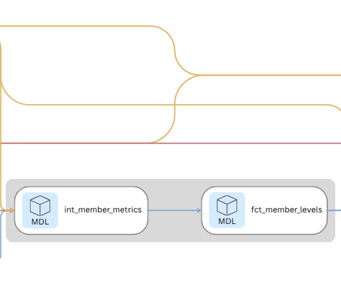
The mart layer is the final stop in the dbt pipeline, where raw data that has been cleaned, joined, and transformed finally becomes something you can actually use. The name comes from data warehousing, where a mart is a purpose-built output designed to answer specific questions rather than store everything. Think of it as the difference between a warehouse and the shelf you actually pull from. The fct prefix stands for fact table, which just means a table that records what happened: who attended, who referred, how engaged each member is. The four tables that come out of this layer are the direct inputs to everything that follows: the network analysis, the Kumu visualization, and the affiliate health report.
fct_member_levels and fct_affiliate_health are the ladder outputs. They answer operational questions without requiring any network analysis. fct_member_levels is a member-level record that could feed a live dashboard tracking where members are moving on the ladder over time: who is progressing, who is stagnating, and whether interventions are working. fct_affiliate_health is the affiliate-level rollup: a foundation for benchmarking affiliates against each other or against their own historical baseline, and a clean input for an executive dashboard that surfaces which affiliates need attention without requiring anyone to dig into the underlying data.
The remaining two tables serve the network analysis exclusively. fct_sna_nodes is the enriched member list: every node in the graph, carrying ladder level, attendance rate, referral count, and centrality metrics forward from the ladder analysis. fct_sna_edges is the co-attendance edge list: every connection between members, with interaction weight as edge strength. Together they are what NetworkX and Kumu need to build the network. The ladder tells you where members stand in their relationship to the organization. The network tells you how they are connected to each other. Neither is sufficient on its own.
Each member's ladder level is assigned based on two signals: how often they attend events relative to how many were available, and how many people they have referred into the affiliate.
with member_metrics as (select * from {{ ref('int_member_metrics') }}),
leveled as (
    select
        member_id,
        member_name,
        affiliate_id,
        join_date,
        referred_by_name,
        referred_by_id,
        attendance_count,
        events_available,
        attendance_rate,
        referral_count,
    case
        when attendance_rate = 0                                        then 'Observer'
        when attendance_rate > 0     and attendance_rate < 0.75         then 'Explorer'
        when attendance_rate >= 0.75 and referral_count = 0             then 'Regular'
        when attendance_rate >= 0.75 and referral_count between 1 and 2 then 'Bridge'
        when attendance_rate >= 0.75 and referral_count >= 3            then 'Anchor'
        end
        as ladder_level
    from member_metrics)
select * from leveled
The mart layer produces four output tables. Two serve the ladder analysis and can be used independently of the network. Two serve the network analysis and feed directly into Step 4.
The pipeline makes the methodology transparent and reproducible. Every transformation is documented in SQL, every output is tested, and every model is described in schema.yml files that serve as the data dictionary for the pipeline itself.
Analyze Network Structure
The dbt pipeline produces the data. The network analysis produces the insight.
With fct_sna_nodes and fct_sna_edges in hand, each affiliate can be modeled as a graph: members as nodes, co-attendance interactions as edges, and interaction weight as edge strength. The analysis was conducted in NetworkX in Google Colab. The goal was not to describe what members did. The goal was to understand how they are connected, whether those connections are distributed or concentrated, and where the structural risks live.
The graph is built from two structural elements: nodes, which represent individual members, and edges, which represent the connections between them. Four measures then describe the structure those elements form:
| SNA Concept | Explanation |
|---|---|
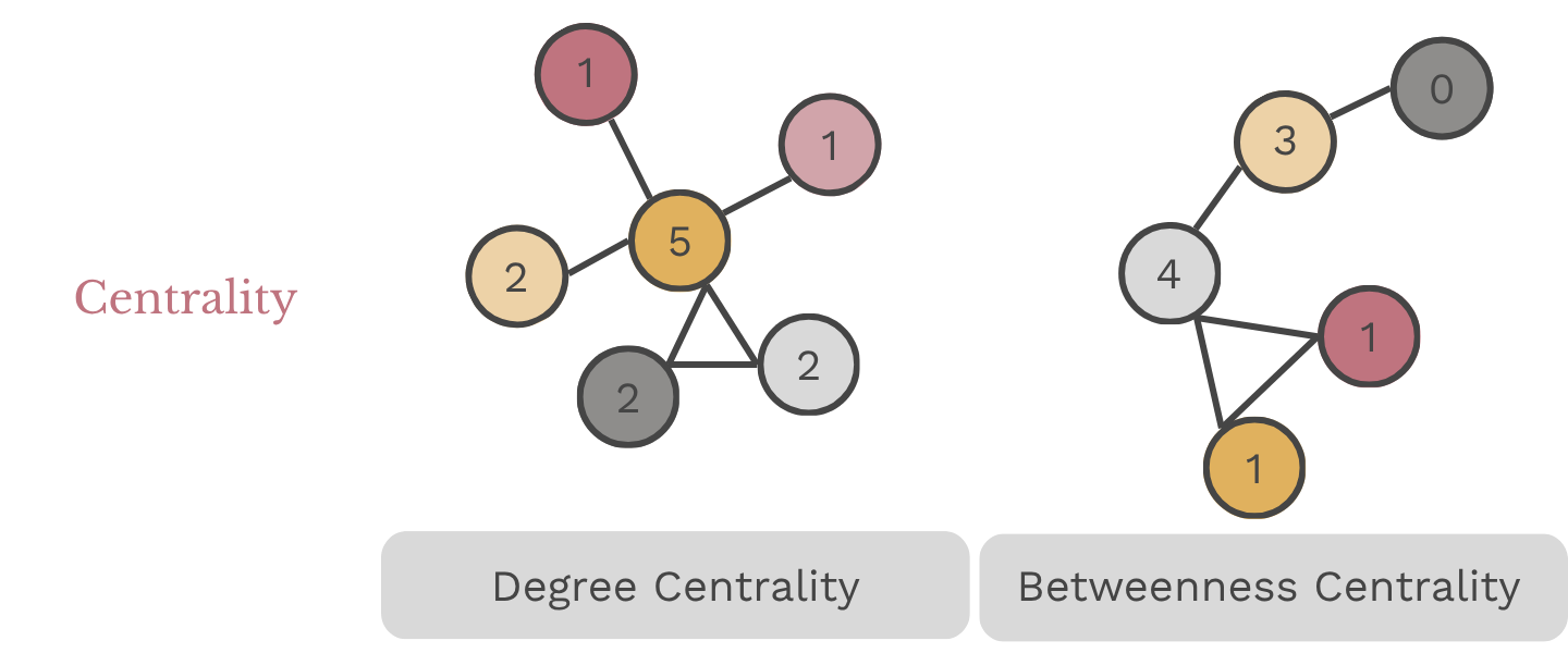
| Degree Centrality | Measures the number of direct connections a node (member) has within the network. A member with high degree centrality is connected to many others. In a healthy affiliate, degree centrality is distributed across multiple members. In a fragile one, it concentrates in a small number of people. |
| Betweenness Centrality | Identifies members who serve as bridges between different parts of the network. A high betweenness score means the network depends on that member to connect others. If that member leaves, those connections break. A score of 1.0 means every path in the network runs through a single person. |
| Network Density | Measures the proportion of actual to possible connections exist in the network. A dense network, score of 1.0, means every member is connected to each other, whereas a score of 0.0 means no one is connected. |
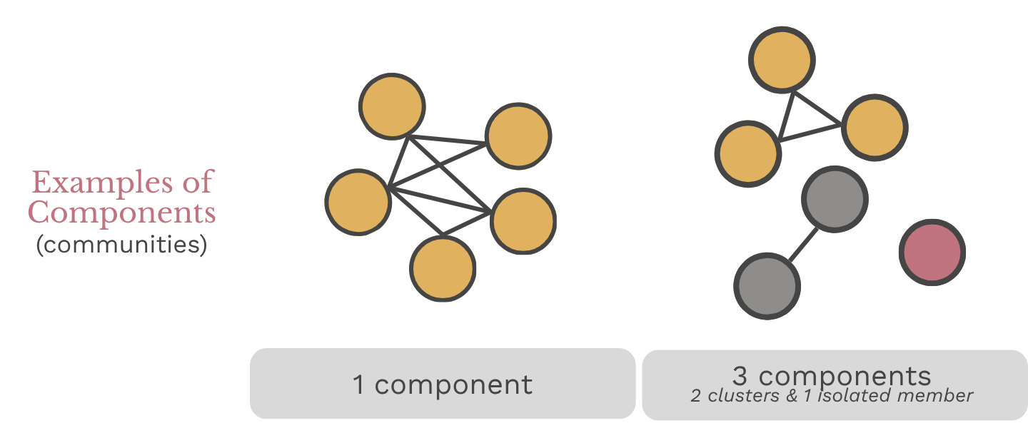
| Components (communities) | A group of members connected to each other but not to anyone outside their group, often used to identify sub-groups within the larger network. |
Together these four measures answer the three core questions the framework was designed to address: how connected is each affiliate, is engagement sustained, and where is the dependency risk.
Build the graph
The dbt outputs become the inputs. Members become nodes. Co-attendance interactions become edges, with interaction weight carried forward as edge strength. One graph is built per affiliate, so the structure of each can be analyzed and compared independently.
import pandas as pd
import networkx as nx

# Filter to co-attendance edges only
    co_attendance = edges[edges['edge_type'] == 'co-attendance'].copy()

# Store affiliate summaries
    summary = []
    for affiliate in sorted(nodes['type'].unique()):
        aff_nodes = nodes[nodes['type'] == affiliate]
        aff_node_ids = aff_nodes['member_id'].tolist()
        aff_edges = co_attendance[co_attendance['affiliate_id'] == affiliate]
# Build graph
    G = nx.Graph()
    G.add_nodes_from(aff_node_ids)
    for _, row in aff_edges.iterrows():
        G.add_edge(row['from_id'], row['to_id'], weight=row['weight'])
Each affiliate is now a graph object. Members are nodes. Co-attendance events are edges. The structure is ready to measure.
Compute Metrics
Four metrics describe the structure of each affiliate's network. Density measures how broadly connected members are. Components identifies whether the network holds together or fractures into isolated clusters. Betweenness centrality names who the network depends on. Degree centrality measures how connections are distributed across members.
  # Network metrics
    density = round(nx.density(G), 3)
    components = nx.number_connected_components(G)
    betweenness = nx.betweenness_centrality(G, weight='weight')
    degree = nx.degree_centrality(G)

    top_bc_node = max(betweenness, key=betweenness.get)
    top_bc_name = nodes[nodes['member_id'] == top_bc_node]['label'].values[0]
    top_bc_score = round(betweenness[top_bc_node], 3)
    top_bc_level = nodes[nodes['member_id'] == top_bc_node]['ladder_level'].values[0]

    avg_degree = round(sum(degree.values()) / len(degree), 3)

# Engagement distribution
    aff_levels = aff_nodes['ladder_level'].value_counts().to_dict()
    total = len(aff_node_ids)
    highly_engaged = aff_levels.get('Regular', 0) + aff_levels.get('Bridge', 0) + aff_levels.get('Anchor', 0)
    pct_highly_engaged = round(highly_engaged / total * 100, 1)

# Referral metrics
    aff_referrals = edges[
        (edges['edge_type'] == 'referral') &
        (edges['affiliate_id'] == affiliate)]
    total_referrals = len(aff_referrals)
    unique_referrers = aff_referrals['from_id'].nunique()
Summarize Results
The metrics are collected into a single summary table: one row per affiliate, with network structure, engagement distribution, and referral pattern side by side. That is the table that feeds Step 6.
    summary.append({
        'Affiliate': affiliate,
        'Members': total,
        'Density': density,
        'Components': components,
        'Avg Degree Centrality': avg_degree,
        'Top BC Node': top_bc_name,
        'Top BC Level': top_bc_level,
        'Top BC Score': top_bc_score,
        'Observer': aff_levels.get('Observer', 0),
        'Explorer': aff_levels.get('Explorer', 0),
        'Regular': aff_levels.get('Regular', 0),
        'Bridge': aff_levels.get('Bridge', 0),
        'Anchor': aff_levels.get('Anchor', 0),
        'Pct Highly Engaged': pct_highly_engaged,
        'Total Referrals': total_referrals,
        'Unique Referrers': unique_referrers})
    summary_df = pd.DataFrame(summary)

# Average co-attendance interaction weight per affiliate
    avg_weight = co_attendance.groupby('affiliate_id')['weight'].agg(
    avg_interaction_weight='mean',
    total_edges='count').round(3).reset_index()
The output is one row per affiliate. Network structure, engagement distribution, and referral pattern are now in a single table, ready for scoring in Step 6.
The Visualization
The metrics tell you what is happening in each affiliate. The maps make it impossible to ignore.
The contrast between affiliates is stark before any styling is applied. Atlanta's network is dense and distributed: connections spread broadly across members, with no single node holding everything together. Chicago's is a hub and spoke: one person sits at the center of every path in the network, and almost nothing connects without running through them. Denver fractures into disconnected clusters: members grouped in isolation, with no ties reaching across groups. The structure of each affiliate is legible at a glance in a way that a metrics table never is.
Affiliate Networks
Building the Maps in Kumu
The network maps were built in Kumu, a web-based tool for social network analysis and relationship mapping. The enriched nodes file from the NetworkX analysis served as the element import: one row per member with label, affiliate, ladder level, attendance rate, referral count, degree centrality, and betweenness centrality. The co-attendance edges served as the connection import, with interaction weight mapped to connection strength so thicker lines indicate stronger ties. The referral edges were imported as a separate connection layer, directed from referrer to recruit.
That produces two distinct network views for each affiliate. The co-attendance network shows how relationships function in the present: who is connected to whom and how strongly. The referral network shows how the affiliate grew over time: who brought whom in and whether that activity is distributed or concentrated.
Reading the Maps
Node color reflects ladder level, using a consistent palette across all five affiliates so the maps are directly comparable. Node size is scaled to betweenness centrality, making the bridges and bottlenecks immediately visible without reading a single number.
A dense cluster of similarly sized nodes signals a healthy, distributed network. A large node surrounded by smaller ones signals dependency risk. Isolated clusters with no connections reaching across signal fragmentation. The visual does not replace the metrics. It makes them human-readable.
import pandas as pd

# Elements sheet
kumu_elements = nodes_enriched.copy()
kumu_elements['Tags'] = kumu_elements['ladder_level']
kumu_elements['Description'] = (
    'Joined: ' + kumu_elements['join_date'].astype(str) +
    ' | Attendance Rate: ' + kumu_elements['attendance_rate'].astype(str) +
    ' | Referrals: ' + kumu_elements['referral_count'].astype(str)
)

elements_out = pd.DataFrame({
    'Label': kumu_elements['label'],
    'Type': kumu_elements['type'],
    'Tags': kumu_elements['Tags'],
    'Description': kumu_elements['Description'],
    'Ladder Level': kumu_elements['ladder_level'],
    'Attendance Rate': kumu_elements['attendance_rate'],
    'Referral Count': kumu_elements['referral_count'],
    'Join Date': kumu_elements['join_date'],
    'Degree Centrality': kumu_elements['degree_centrality'],
    'Betweenness Centrality': kumu_elements['betweenness_centrality'],
    'metrics::last': 1  # Kumu field: pins this metric as the display default
})

# Connections sheet: co-attendance edges with member names mapped from IDs
co_connections = co_attendance[['from_id', 'to_id', 'affiliate_id', 'weight']].copy()
id_to_name = nodes_enriched.set_index('member_id')['label'].to_dict()
co_connections['From'] = co_connections['from_id'].map(id_to_name)
co_connections['To'] = co_connections['to_id'].map(id_to_name)
co_connections['Direction'] = 'mutual'
co_connections['Type'] = 'Co-attendance'
co_connections['Strength'] = co_connections['weight']
connections_out = co_connections[['From', 'To', 'Direction', 'Type', 'Strength']]

# Referrals sheet
ref_edges = edges[edges['edge_type'] == 'referral'].copy()
ref_edges['From'] = ref_edges['from_id'].map(id_to_name)
ref_edges['To'] = ref_edges['to_id'].map(id_to_name)
ref_edges['Direction'] = 'directed'
ref_edges['Type'] = 'Referral'
referrals_out = ref_edges[['From', 'To', 'Direction', 'Type']]

# Export to Excel
with pd.ExcelWriter('kumu_affiliate_health.xlsx', engine='openpyxl') as writer:
    elements_out.to_excel(writer, sheet_name='Elements', index=False)
    connections_out.to_excel(writer, sheet_name='Connections', index=False)
    referrals_out.to_excel(writer, sheet_name='Referrals', index=False)

files.download('kumu_affiliate_health.xlsx')
The export produces three sheets: Elements, Connections, and Referrals. Kumu reads them directly. The network is ready to map.
The Findings
The pipeline, the network analysis, and the maps all build toward one output: a health profile for each affiliate that names what is working, what is fragile, and where the risk lives.Each affiliate is evaluated across the three questions the framework was designed to answer:
These three questions do not produce a single score. A number would flatten what is actually a nuanced picture. Instead each affiliate receives a health profile that holds all three dimensions together and names what they reveal in combination.
The Five Affiliates
The five affiliates in this dataset were designed to represent distinct health profiles. The contrast between them is where the framework earns its value. Headcount alone would not distinguish these affiliates. The combination of connectivity, sustained engagement, and dependency risk makes the differences visible and the risks actionable.
| Affiliate | How Connected? | Is Engagement Sustained? | Where is the Risk? |
|---|---|---|---|
| Atlanta | High density, 2 components | 72% highly engaged | Low — risk distributed across 9 referrers |
| Seattle | Moderate density, 3 components | 57% highly engaged | Moderate — some dependency risk |
| Phoenix | Low density, 5 components | 33% highly engaged | Emerging — thin but not broken |
| Chicago | Low density, 1 component | 7% highly engaged | Critical — one person holds the entire network |
| Denver | Very low density, 7 components | 0% highly engaged | Severe — fragmented with little to no path to reconnection |
Atlanta and Chicago tell the starkest story. Both have 15 or more members. Both have active referral networks. But where Atlanta's connections are distributed and its engagement runs deep, Chicago's entire network runs through one person. Remove that person and the affiliate has no connections at all. That is the difference between a healthy affiliate and a fragile one, and it is invisible in a headcount report.
The Reports
The findings are documented in five affiliate health reports, one per affiliate, each structured around the same three questions. The reports are written in plain language for organizational decision-makers rather than data practitioners. The goal is not to present the methodology but to surface what it found and what it means for the affiliate.

What Makes this Possible
Participation data tells you who showed up. This framework tells you what happened after they did. That shift, from counting activity to understanding how engagement actually functions, is what makes the difference between a report that describes a problem and one that names where the risk lives and what to do about it.
For a federated organization managing multiple affiliates, that distinction matters. A headcount report treats all affiliates as comparable. This framework makes the differences visible. An affiliate with 15 members and a density of 0.889 is not the same as an affiliate with 15 members and a density of 0.133. One is resilient. The other is one departure away from collapse. Without a relational lens, both look the same in a spreadsheet.
What it makes possible in practice:
- Early risk identification. A bottleneck or fragmentation signal surfaces before a key member leaves, not after. The framework gives organizational leaders time to act rather than react.
- Targeted support. An affiliate weighted toward Observers and Explorers needs different support than one weighted toward Regulars and Bridges. Knowing where members stand makes it possible to design interventions that meet affiliates where they are.
- Leadership succession planning. When betweenness centrality is concentrated in one person, that person's departure is a structural risk. Naming that risk explicitly creates the conditions for intentional succession planning before it becomes a crisis.
- Referral strategy. Knowing which members are bringing others in, and whether that activity is distributed or concentrated, makes it possible to invest in the right people rather than assuming growth will happen organically.
| Without this framework | With this framework | |
|---|---|---|
| Early risk identification | A key member leaves and the affiliate loses half its active members. The signal was always there. | A bottleneck or fragmentation signal surfaces before a key member leaves. Leaders have time to act. |
| Targeted support | All affiliates receive the same support regardless of where their members actually stand. | Support is designed to meet each affiliate where it is, based on engagement distribution. |
| Leadership succession planning | Dependency risk is invisible until the departure that reveals it. | Betweenness centrality names the risk explicitly, creating conditions for intentional succession planning. |
| Referral strategy | Growth is assumed to happen organically, with no visibility into who is driving it. | Referral patterns are visible and actionable, making it possible to invest in the right people. |
Where This Goes Next
This project uses a synthetic dataset to demonstrate the framework. Applied to real organizational data, the methodology becomes a repeatable evaluation tool. The ladder levels, the interaction weights, and the health dimensions can all be adjusted to reflect the specific context of a given organization. What stays constant is the underlying question: not who showed up, but what happened after they did.
A few directions worth exploring:
- Tracking change over time. Running the analysis at regular intervals would surface whether affiliates are growing healthier or more fragile, and whether interventions are having the intended effect. A single snapshot tells you where things stand. A series of snapshots tells you whether they are moving in the right direction.
- Integrating survey data. Co-attendance captures whether members showed up together. It does not capture the quality of those interactions. Pairing the network analysis with a short relational survey would add a layer of depth that attendance data alone cannot provide. The structure tells you who is connected. The survey tells you whether those connections are meaningful.
- Building a live dashboard. The dbt pipeline is already running against BigQuery. Connecting it to a visualization layer would make the affiliate health metrics available in real time rather than as a periodic report. The framework is built for this. The infrastructure is already in place.